Category: clickmap
Geographies of container shipping: the awesome interactive Shipmap
Given that over 90% of the world’s goods have travelled by sea, anyone interested in ‘follow the thing’ research needs to have a detailed sense of the geographies of container shipping. This animated, interactive shipmap shows global commercial shipping movements (including but not limited to container shipping) in 2012. It’s awesome. It was shortlisted for the Global Editors Network Data Journalism Awards in 2016. Click the image to get to it. Click play and all is explained. Then experiment.
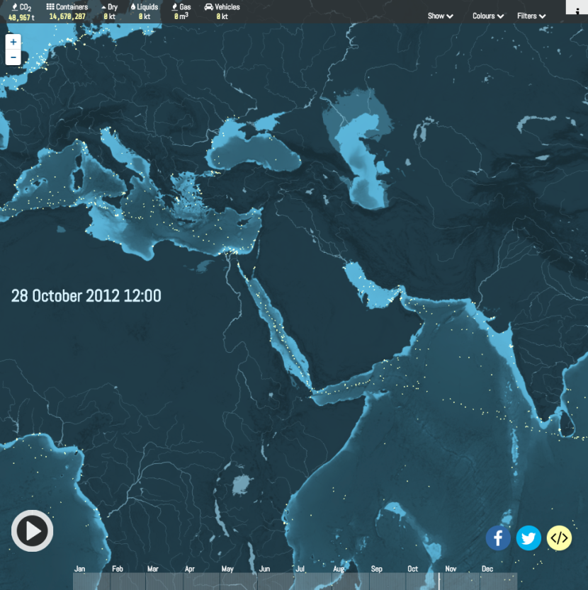 Created by London-based data visualisation studio Kiln and the UCL Energy Institute.
Review of the year: our 2016 clickmap
As we come to the end of 2016, we’d like to say a big thank you to all of our shoppers around the world.
We look forward to your custom in 2017.
Very best wishes
Ian et al
PS for a detailed breakdown of 2016’s analytics, browse our full ClustrMap page.
