Geographies of container shipping: the awesome interactive Shipmap

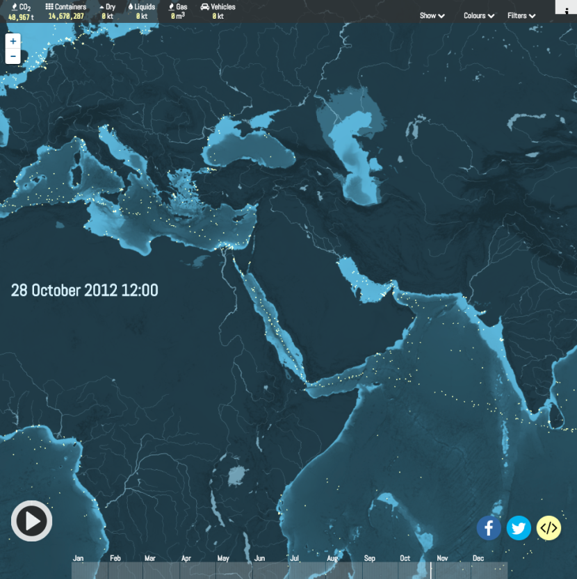
Given that over 90% of the world’s goods have travelled by sea, anyone interested in ‘follow the thing’ research needs to have a detailed sense of the geographies of container shipping. This animated, interactive shipmap shows global commercial shipping movements (including but not limited to container shipping) in 2012. It’s awesome. It was shortlisted for the Global Editors Network Data Journalism Awards in 2016. Click the image to get to it. Click play and all is explained. Then experiment.

 screen-shot-2017-01-03-at-17-04-17Created by London-based data visualisation studio Kiln and the UCL Energy Institute.
Advertisement

Leave a Reply

Fill in your details below or click an icon to log in:

WordPress.com Logo

You are commenting using your WordPress.com account. Log Out /  Change )

Twitter picture

You are commenting using your Twitter account. Log Out /  Change )

Facebook photo

You are commenting using your Facebook account. Log Out /  Change )

Connecting to %s

This site uses Akismet to reduce spam. Learn how your comment data is processed.